
By Christine Swan
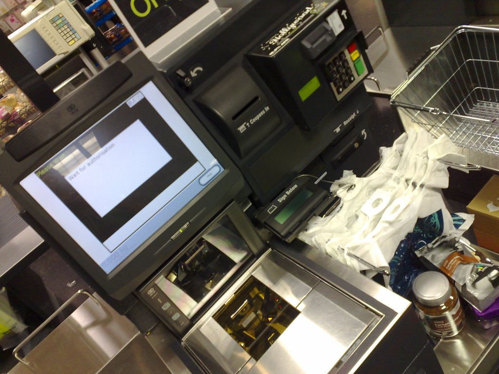
Self-service checkout by Jay Gooby from Brighton, United Kingdom, CC BY 2.0 https://creativecommons.org/licenses/by/2.0, via Wikimedia Commons
I am a complete technophile. I love gadgets and new tech, and I have been an enthusiastic early adopter of valuable and useful new products. However, as we have moved away from more formal, linear methods of software and interface development, towards quicker, and more flexible ways of working. I worry that the: “Well, it works ok for me”, way of thinking is dominating user interface design. My current gripe was inspired by my most recent trip to my local supermarket.
A traditional supermarket checkout is a combination of hardware, software and a human operator. If the weighing platform isn’t working, they usually have a trick up their sleeve, perhaps a good old thump accompanied by an: “Oh it always does that,” reassuring comment. I am just a bystander, the operator knows what they are doing and we exchange pleasantries while they do it.
Today, only one checkout was manned, which had a sizeable queue of people with trollies piled high. With a sigh, I trudged to the automated checkouts of which, the vast majority were free. “Don’t put your bag on the surface!”, said the member of staff in the previous supermarket where I had last used one. So, to be safe, I put my bag on the floor. I was presented with two options, which were “Start” and “Use own bag”. I wanted to press both, beginning with the start button perhaps? Everybody knows what start means and the button was on the left – so that’s right, yes?
After scanning the first item, the machine started beeping – “PLACE THE ITEM IN THE BAG” followed by, “CALL AN ASSISTANT”. Apparently, in this supermarket, you DO put your bag on the platform, which is also the weighing scale. Ah, OK, that makes sense. Next come bananas. I selected bananas and put them in my bag. No, that was wrong. They needed to go somewhere else to be weighed on a different weighing platform. “But what’s wrong with this one?”, “It’s just different. Not this one, that one – the one over there that prints stickers”.
After I had confirmed with the system that the bananas really were bananas and that they had been weighed on the scales, but not the ones in front of me, I finally reached the: “Finish and pay” screen and breathed a huge sigh of relief.
There is an expectation that anyone can use these things and can also adapt to different configurations and user interfaces in the different supermarkets that they use. We are expected to use them no matter how poorly designed their user interface is. Enthusiastic staff say: “It’s really easy” and wave their hands about to demonstrate. No, it isn’t and their Jedi mind-tricks don’t work on me.
I learned user interface design the old way. A good design is intuitive, uses natural language, is unambiguous, makes use of what the user knows already and prevents errors. If a software tester had observed me using their system and counted the number of errors that I made, hopefully this would prompt a rethink. If it isn’t intuitive, and you are not providing instructions, it’s unlikely to increase efficiency and throughput. I spent far more time faffing around with my weekly shop than I would do at a manned checkout.

A classic software user interface book – Alan Cooper’s About Face
I do wonder what the long-term goal is – go the Amazon Fresh way and automate everything? In terms of customer service, I believe these machines are a massive own goal. I don’t mind them for small purchases, such as a sandwich and a drink, and they seem to work ok within those contexts, but I really don’t have the time or patience to keep learning new systems for different supermarkets. Time for some standardisation methinks. I dislike the impersonal nature of the shopping experience too.
More recently, Booths supermarkets have scrapped them completely and in the Netherlands, a “slow lane” is being introduced in some supermarkets to give people time to have a chat at the checkout. If my mother was still alive, she would have detested the removal of human contact from the shopping experience. As a deaf person, lip-reading was a key way that she was able to communicate. Our local Aldi was superb and one particular checkout operator took particular care to speak to my mother kindly and in a way that demonstrated that she understood how to speak in a way that made lip-reading easier.
I’m less bothered about chit-chat during the weekly shop but I am frustrated by systems that don’t function as intended, have not prioritised or even considered usability, and the rules of intuitive systems design. Usable software is efficient and allows you to get more done in less time. It also creates a positive experience for the user who gains the pleasure of successful achievement of their goals. The system developers in this case would benefit from reading some of the classic texts in user interface design and experience. This old dog can learn new tricks – but only if they are worth learning.

Leave a comment